Stating the Case for the State
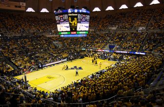
West Virginia University will unveil a new design for the basketball floor at the WVU Coliseum today. Without any inside knowledge, we don’t know what the design will be. We don’t know what changes (if any) will be made to the paint color of the lane, coloring within the 3-point line, design, color scheme and wording of the end lines and sidelines. Saying there are a myriad of possibilities might be a bit much, but there have been a fairly wide swath of differing designs in the past. Remember the God-awful inside the 3-point line design that looked like a basketball? Ugh.
What we do know, with close to absolute certainty, is what mid court will look like. You can bet dollars to donuts that painting on the mid-court circle will be the iconic “flying WV” logo. It’s not only become synonymous with the university, but the entire state. If you go anywhere in the country wearing the “flying WV” and you encounter even a causal college sports fan, he’ll know what school you’re repping.
? Follow @WVUSports over the next 24 hours as we unveil our new WVU Coliseum court design for the 2019-20 season. I love it! #HailWV pic.twitter.com/Xfk9JPODSh
— Shane Lyons (@WVUADLyons) May 22, 2019
On the new design, the “flying WV” might be blue. It might be gold. But it will be there. And, if the last three decades are any indication, it will be there alone. And it shouldn’t be.
As one not shy from offering unsolicited advice, WVU should change the rubber-stamp plans for mid court (and midfield in football). Why not put the outline of the state at mid court (and, again, midflied. For the rest of this piece, this design plan also includes changing midfield at Mountaineer Field.) This is the state’s primary university. Don’t separate yourself from the state – boast it proudly. WVU needs to increase its use and the prominence of the geographic outline of the state into its playing fields, uniforms, billboards, advertising and online presence. Marshall is much more conspicuous in its use of the state outline than is its Morgantown counterpart. Sorry, but West Virginia is the school of the state. Not Marshall.
This is not advocating the elimination of the “flying WV.” WVU can’t do that. The athletic department shouldn’t do that. The suggestion: Make the state’s geographic outline the dominant feature at mid court, with a smaller, but still prominent, “flying WV” inside it. Think the state painted in old gold, with the “flying WV” in blue in the dead center. The university logo prominent, but sharing the spotlight with the state. The Mountaineers don’t just represent the university. They are ambassadors to the entire state. “Take Me Home, Country Roads” isn’t about High Street, after all.
It’s great that legendary football coach Don Nehlen and crew designed a letter logo that became, in relatively short shrift, iconic. Among “letter logos” for universities (discount the Florida Gator head or Kansas’s Jayhawk, for example), what are the ones that immediately jump out? The Michigan “M”. Notre Dame’s interlocking “ND”. Oklahoma’s “OU”. Duke’s Old English “D”. Miami’s “U”. And West Virginia’s “flying WV”. And all of those, sans Miami, are far far older than the “flying WV.”
In the early 80s, both mid court and midfield had a gold-painted geographic West Virginia outline. It was a great look. Before the creation of the “flying WV,” the West Virginia logo was the state outline with a diagonal oval with “WVU” inside. That was NOT a great look. Ok, compared to the “flying WV,” it sucked.
But in the school’s (logical) desire to burn its brand into the state – and national – psyche through the iconic logo, it created a subconscious wall keeping the university in, the rest of the state out. A visual connection to the state of West Virginia has been, if not lost, at least diminished.